Meet
InstaAdventure
This platform decreases gear waste and increases accessibility to outdoor activities by reducing the cost and connecting users with freelancing guides.

Project Overview
Roles
User Experience Designer
User Experience Researcher
Visual Designer
Project Specification
Duration: 6 weeks
Tools:
-
Figma
-
Mural
-
Adobe
Deliverables
-
Competitive analysis
-
User interviews and surveys
-
Personas
-
User journey map
-
Low-fidelity wireframes
-
High-fidelity mockups and prototypes
-
Design system
-
Usability tests and findings
Project Plan
_edited.png)
Project Proposal
Many individuals are eager to experience outdoor activities, yet they face significant barriers due to the financial commitments required for gear and the difficulties of finding a supportive community. This creates an exclusionary environment where only a privileged few can fully engage in outdoor pursuits.
Imagine a scenario where cost is not a hindrance and forming connections is seamless. What if access to gear and a welcoming community were readily available to everyone, regardless of their financial status or existing social circles? The current solutions fall short in addressing these fundamental issues, leaving a substantial portion of enthusiasts on the sidelines.
InstaAdventure's proposed solution is to create an inclusionary environment with a sharing economy mobile application. By connecting gear owners looking to share their equipment with those who aspire to explore new activities, we're breaking down financial barriers. This platform simultaneously creates a space where individuals can bond over shared passions, fostering an inclusive and supportive community.
How Can We Help These Users?
User Research
Our research involved observing the limitations of current rental processes and exploring how these constraints impact our target users. We utilized semi-structured interviews and think-aloud techniques to understand how existing gear rental solutions align with user needs and delved into their perspectives, frustrations and aspirations. This exploration guided us in gauging interest and shaping the minimum viable product, putting users at the heart of our approach.
Following our user-centered research, each team member meticulously reviewed the data encompassing interview notes and observation particulars. Collaboratively, we engaged in discussions to share interpretations, takeaways, and unforeseen revelations derived from participants' feedback.
Our analysis involved a thorough thematic examination, unearthing recurring patterns, noteworthy insights, and overarching impressions. Our collaborative efforts progressed into the strategic organization of sticky notes, clustering them into coherent categories sharing common themes.
Meet the Users
We identified 3 main personas that embody our target audience.
Ideation
With personas cultivated from user research, we embarked on the ideation stage for InstaAdventure.
Grounded in user needs, we crafted an intuitive information architecture. This structure empowers users by providing seamless access to vital functionalities and content. Our approach ensures that interactions align seamlessly with their expectations.
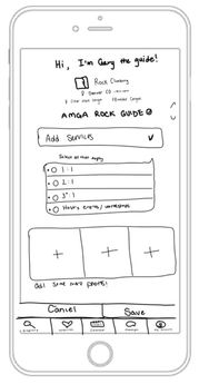
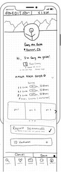
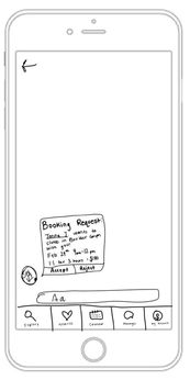
Next, we worked on translating our vision into a tangible form. We utilized paper prototypes and storyboards, which allowed us to envision user journeys, interactions, and interface layouts.
From personas to paper, our ideation process embodies a harmonious blend of empathy, creativity, and strategic thinking.
This story board is created with the "Gary the Guide" persona in mind. He is coming to the app to create a guide profile page so that he can connect with people in his community who want to learn from his expertise.
Cognitive Walkthrough and Usability Refinement
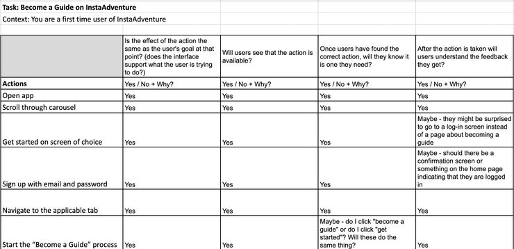
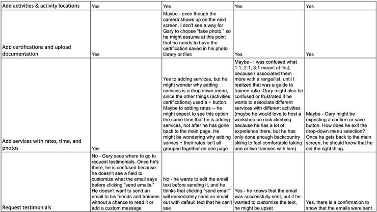
Our aim with this evaluation was to gauge the user-friendliness of the application for novices and assess its alignment with user goals. Fellow classmates took on the role of evaluators, scrutinizing the guide, renter, and lender task flows. Through the lens of a cognitive walkthrough, they explored the application, identifying concealed, missing, or unclear elements. Their feedback offered invaluable insights into the user experience.
Evaluators were equipped with a toolkit of materials, ranging from paper prototypes and task descriptions to user persona profiles. A comprehensive spreadsheet guided evaluators through a set of cognitive walkthrough questions, each step evaluated for usability.
Post-evaluation, we examined the usability issues surfaced by evaluators and assessed their severity. Armed with insight, we refined the paper prototypes with user-centered improvements.
High Fidelity Prototype Development
Before delving into the high fidelity prototype, we established a comprehensive style guide. This guide served as a blueprint for consistency and cohesiveness across the application. Drawing inspiration from the essence of our application—dedicated to nature enthusiasts—we selected a palette of greens and blues. These colors resonate with themes of trustworthiness, growth, health, and strength—values at the core of our app's identity.
Incorporating these chosen colors, we sculpted a visual identity that radiates the application's essence. The harmony of greens and blues infuses the interface with a sense of calm and harmony, mirroring the tranquility of nature. Complementing this palette, we opted for a simple yet easily legible font, ensuring a seamless and comfortable reading experience for users.

Our high fidelity prototype came to fruition through work in Figma. With the style guide as our compass, we embarked on the journey of transforming ideas into a dynamic and interactive user experience.
The guide task flow displayed caters to guides seeking to provide personalized training, enabling them to step away from large corporations and offering the flexibility to define their own schedules. The insights gleaned from our paper prototypes played a pivotal role in shaping this task flow. We've taken these learnings and infused them into every step of the guide's journey, ensuring a seamless and intuitive process.

User Testing
Experimental Plan
This phase involved a controlled experiment, observations, and insightful interviews, all aimed at refining the user experience.
Eight participants engaged in our user testing, navigating our Hi-Fi prototype through carefully constructed scenarios. The experiment focused on the renter flow, comparing the application to existing solutions. This controlled environment allowed us to measure key variables that illuminate the user experience. Additionally, each participant embarked on the task of setting up a guide profile. This exercise assessed completion time, lostness, usability, and user satisfaction. These metrics provided a comprehensive view of the effectiveness of our design.
Results and Insights
The feedback we received not only shed light on areas that required enhancement but also reinforced the value that our application brings to its users. Here are some key insights:
High usability and low lostness
Guide and rental tasks on InstaAdventure showcased above-average system usability results and a lostness score below 0.4, indicating that users navigated the tasks without undue confusion.
High value and room for growth
Users demonstrated genuine appreciation for the application's value, although some areas emerged as opportunities for enhancement:
-
Refine error handling
-
Providing users with clearer guidance on next steps
-
Layout of calendar and time selector
InstaAdventure is remarkably faster than REI
InstaAdventure boasted a 55% decrease in mean completion time for the gear rental task when compared to REI
Final Takeaways
1
Listen to Users!
Removing my own personal bias was particularly hard for me with this project as I identify with the target user group. However, along the way, I often realized that my assumptions about users were not accurate. Always listen to your users first and foremost!
2
Scope Creep
Brainstorming was a super power of this team, however, we struggled to let go of some ideas so that we could focus on the main tasks. We found ourselves re-focusing several times throughout the process, realizing that we did not have the time or resources to create an app that does it all.
3
Teamwork Makes the Dream Work
I had the pleasure of working with a team that functioned like a well-oiled machine. We complimented one another's strengths and weaknesses in ways I could not have anticipated. I learned how essential it is to have a team that cultivates collaboration at every step.


