ACX
Creating a Connected Experience for Global Mobility
ACX is a unified digital ecosystem for Andersen’s global mobility program—designed to replace spreadsheets, streamline operations, and elevate the experience for international assignees, clients, and internal teams alike.

Project Overview
Client
Andersen Global
Challenge
Andersen is a trusted leader in global mobility tax and advisory services. However, their internal systems couldn’t scale with their ambitions. Processes were fragmented, managed largely through Excel spreadsheets, emails, and manual tracking. This made it difficult to serve high-volume clients like Amazon, deliver a seamless experience to relocating employees, or scale operations efficiently.
They needed a comprehensive transformation to digitize operations, differentiate their offering, and create a premium client and assignee experience.
My Role
Lead designer and strategic partner
Solution
We designed and built a unified three-part platform that redefined Andersen’s digital service delivery:
-
Client Portal (Experience cloud site) – Gave corporate clients real-time visibility into mobility programs, engagement details, and employee progress.
-
Assignee Portal (Experience cloud site) – Empowered relocating employees with a personalized hub to manage tasks, upload documents, and engage directly with Andersen advisors.
-
Salesforce Org – Provided Andersen’s internal teams with a centralized system to manage workflows, track progress, and ensure compliance and quality at scale.
THE PROCESS - STEP 1
Understand & Define
Immersing Ourselves in Global Mobility
To kick off the project, I led a three-day in-person discovery workshop with Andersen’s global mobility team and our internal Salesforce architects. This immersive session was designed to help us deeply understand Andersen’s world—from how global mobility is currently managed, to what clients and their relocating employees truly need in order to feel secure, supported, and in control.
During the workshop, I facilitated exercises to:
-
Capture business goals
-
Learn about users
-
Map high-level user journeys for internal teams, clients, and assignees
-
Surface opportunities for automation, transparency, and brand differentiation
-
Align requirements with business goals
-
Define our MVP


Who Are We Designing For?
Global mobility is a complex and often stressful process involving tax compliance, cross-border logistics, and constant communication. Before we could design anything, we had to get inside the mindset of three distinct but deeply interconnected user groups:
-
Andersen Internal Teams managing hundreds of international moves and engagement tasks
-
Corporate Clients (such as Amazon) overseeing large-scale mobility programs
-
Assignees—the employees relocating to new countries with high expectations for clarity and care
Core Personas
I developed three core personas—each aligned to one of the systems we were designing. As the project progressed, we expanded these into more nuanced personas to reflect key differences in user roles, system permissions, and varying access levels, needs, and expectations.


Outcome
By the end of the workshop, we had:
-
Outlined end-to-end user journeys, highlighting critical tasks and touchpoints
-
Drafted user personas representing each core group
-
Clarified system-level requirements and early feature themes
-
Built trust and alignment across technical and business teams
-
Defined our MVP
Corporate Client MVP Process Flow

Assignee MVP Process Flow
Internal Andersen MVP Process Flow

Problem & Solution Framing
Coming out of the Understand & Define phase, the core challenge was clear:
Andersen could no longer manage global mobility programs with spreadsheets and email chains—especially when trying to serve high-volume clients or win new business.
To compete in a modern market, they needed user-friendly digital portals that could scale with their clients’ needs, reduce manual overhead, and instill confidence in mobile employees navigating complex tax and relocation processes.
Our solution was ACX – the Andersen Connected Experience—a three-system ecosystem designed to support each key user group:
-
A Client Portal to give enterprise clients real-time access to program details and engagement status
-
An Assignee Portal to help mobile employees manage tax tasks and stay informed
-
A Salesforce Org to support Andersen’s internal teams in delivering and orchestrating this complex work efficiently
THE PROCESS - STEP 2
Ideation��
With alignment on user needs and solution direction coming out of our workshop, we transitioned immediately into ideation. Andersen had a clear business urgency: they wanted to showcase the new portals in sales demos right away, even as we continued building them. This urgency meant we had to move fast—without sacrificing thoughtfulness or UX quality.
Quickfire Ideation: From Insight to Interface
To keep pace with Andersen’s aggressive timeline, I took one focused day immediately after the workshop to brain-dump ideas into low-fidelity wireframes. With a clear understanding of the users, their needs, the business priorities, and the constraints of our implementation budget, I was able to move quickly and purposefully.
These early wireframes weren’t just creative explorations—they were strategic tools. I intentionally leaned into Salesforce Experience Cloud’s out-of-the-box components wherever possible to balance usability, scalability, and speed. The goal was to design solutions that met user expectations without over-customizing—ensuring we could deliver value quickly without compromising future flexibility.
These first wireframes gave us something tangible to react to—and became the spark for the collaborative design process that followed.
Initial Wireframes: Assignee Portal

Agile Design in Action
With initial wireframes in hand, I led daily collaborative design sessions over the course of several weeks with both stakeholders and developers. These sessions became the engine of our agile approach—rapid, iterative, and deeply collaborative.
In each session:
-
I shared wireframes live, based on workshop outcomes and quick ideation
-
We refined requirements together, adjusting flows and layouts in real time
-
We validated feasibility with developers as we designed
-
My team captured user stories on the fly, allowing us to write requirements and validate UX simultaneously
After each session, I tightened requirements, iterated on designs, and prepared the next feature area to review. This fast-paced, feedback-driven loop helped us surface edge cases early, align on terminology, and continuously evolve the experience.
Initial Wireframes: Client Contact Portal
.jpeg)
Wireframes Transformed
Design didn’t stop once the wireframes were shared—it evolved daily.
After each session, I tightened requirements, iterated on designs, and prepared the next feature area to review. This fast-paced, feedback-driven loop helped us surface edge cases early, align on terminology, and continuously evolve the experience.
Below is an examples of how two screen transformed over time—from initial draft to validated wireframe.
Tax Return Review Flow: Step 1 Screen
.jpeg)
Set Preferences Flow: Step 2 Screen
.jpeg)
THE PROCESS - STEP 3
Design
Branding & Visual Direction
Armed with validated wireframes, we moved into the design phase. Because we were leveraging Salesforce Experience Cloud out-of-the-box components wherever possible, we made a strategic decision to focus full mockups only on the home pages and login experience—the most visible and sales-critical screens.
I collaborated with Andersen to align on branding direction. While their team provided some general brand guidelines, I also had the freedom to curate visuals that matched their aspirational tone. The goal was to create a professional, reassuring, and modern feel that would instill confidence in clients and mobile employees navigating complex tax and relocation workflows.
I translated this direction into a small set of high-impact mockups. These quick visual explorations helped Andersen visualize what was possible using mostly out-of-the-box components and provided an early touchpoint to validate the overall design direction.
Once the direction was approved, I implemented the branding directly in the Experience Cloud site sandboxes that developers were already configuring. Given the limited styling flexibility of Experience Cloud, this approach helped us move fast while still creating a cohesive, branded experience that met the needs of both internal users and external stakeholders.

Custom Components
While the majority of the interface used Salesforce standard components, we identified a few high-value areas where custom UX would be essential for the MVP. I collaborated closely with developers to design each of these in a way that was simple, lightweight, and implementation-friendly—balancing function and feasibility in a tight timeline.
Tax Return Review Flow
One of the most complex flows we tackled was a custom tax return review interface. Users needed a streamlined experience to:
-
View a summary of what was prepared
-
Upload comments or approvals
-
Understand deadlines and next steps
I designed a clean, intuitive UI that could be reused across all tax returns, regardless of the country, and worked with devs to ensure it aligned with the system’s backend data model

Contact Care Component
In a system with cross-office coordination, knowing who to reach out to is critical. I designed a reusable Contact Card component that displays key team members, their roles, and contact info—tailored to the user’s location and engagement context. This was surfaced throughout the portals to reduce ambiguity and support seamless communication.

Email Templates
I created flexible, branded templates for the system’s core notification flows. These included:
-
Task assignments and due dates
-
Document requests
-
Tax return availability
-
Client approval nudges
The designs were structured to feel personal and human—while still scalable across a variety of notification types.

THE PROCESS - STEP 4
Supporting Development & Delivery
As design transitioned into development, I remained actively involved—not just handing off files, but stepping into a strategic partner role across QA, stakeholder engagement, and delivery support.
I continued leading weekly working sessions and demos with Andersen, helping them clarify evolving requirements and make informed decisions about timeline, budget, and feature tradeoffs. My deep understanding of the flows and user needs positioned me to guide conversations that kept the project both user-centered and delivery-conscious.
Hands-On QA Support
To support the dev team, I took on manual QA responsibilities—writing test scripts, validating behavior against our intended flows, and collaborating closely with developers to troubleshoot issues. Because I had been involved from discovery through design, I was able to quickly spot discrepancies, surface gaps, and ensure the experience aligned with user expectations.
This close involvement also helped ensure that our first round of User Acceptance Testing (UAT) started with strong functional coverage—but the real challenge came during execution.
Enhancing UAT Efficiency
Leveraging deep knowledge of user flows and client needs, I led UAT and transformed a chaotic process into a streamlined system.
The Challenge
Our first round of UAT relied on a static spreadsheet, and it quickly became clear that we lacked a structured way to guide testers, collect feedback efficiently, and tie it all back to specific flows. The issues we encountered included:
• Manual, time-consuming documentation processes
• Feedback overwhelmed us in volume and complexity
• Screenshots and context were often lost or misaligned
• Testers struggled with navigation across multiple disconnected tools
The Solution
To improve UAT effectiveness, I designed a Figma-powered UAT system, which combined interactive UX documentation with guided feedback workflows:
-
Interactive Prototype: Testers used a clickable Figma file to walk through specific flows
-
Step-by-step Scribes: Each step linked to a tutorial, ensuring testers followed structured paths
-
Google Site Feedback Hub: A centralized feedback form routed comments directly into Jira—organized by flow, component, and issue typeThis streamlined experience reduced confusion, preserved context, and gave us structured, traceable feedback to act on quickly.
THE PROCESS - STEP 5
Where Are We Now?
With both portals stood up in Sandboxes and functioning, Andersen now has a working version of the ACX platform they can demo to clients—and they’ve already begun using it in conversations with prospective partners.
Our focus has now shifted inward, as we work to optimize the internal experience for Andersen’s global mobility team. This includes refining workflows, improving usability, and ensuring the Salesforce org supports teams in delivering efficient, consistent service across jurisdictions.
Continuing Collaboration & Growth
To kick off this next phase, we hosted a second in-person workshop to check in, evaluate the platform, and gather additional requirements. The session focused on surfacing new pain points, prioritizing enhancements, and aligning on future-state needs for internal users.From that workshop, I:
-
Captured and organized updated requirements
-
Led collaborative release planning to define short-term and long-term focus areas
-
Wrote new user stories tied to real tasks, edge cases, and internal priorities
-
Began working on page layout updates, additional workflows, and custom component enhancements for the internal Salesforce org
As we continue this phase, I’m acting as both UX strategist and delivery partner—bridging user needs, system limitations, and business priorities to evolve the ACX platform into a tool that supports Andersen’s global mobility operations from end to end.
Automation & Enhancement
Our current focus is on reducing manual effort, enhancing system intelligence, and minimizing risk through smarter workflows and tighter governance.
Key initiatives include:
-
Automating repetitive data entry and dependency-driven field population to speed up engagement and employee setup
-
Simplifying complex workflows to reduce human error and ensure consistency across offices and jurisdictions
-
Implementing advanced role-based permissions to provide the right access, at the right time, to the right users—tailoring visibility and actions based on job function
-
Introducing smarter defaults, validations, and task triggers that make the system easier to use and harder to misuse
-
Enhancing the user experience across internal screens to reduce clicks, eliminate ambiguity, and promote clarity in every step
These enhancements not only support scalability, but also signal to clients that Andersen is investing in operational excellence—positioning the ACX platform as a differentiator in a highly competitive space.
Curious to See More?
This was a massive, enterprise-scale effort to design and deliver a connected experience across portals and internal tools. Not only did I help shape and support the external-facing platforms, but I’ve also been deeply involved in simplifying complex workflows inside Salesforce—ensuring internal users can operate with clarity, consistency, and confidence.

Take a look at some of the key flows from the Salesforce experience.
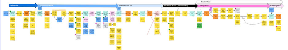
Creating a Client Account
Andersen users initiate the setup of new client accounts to serve as the central hub for managing client data. Each account holds key contact information and acts as the anchor point for linking all related global mobility engagements.

Creating an Engagement
Once a client account is established, Andersen users can create one or more engagements tied to that client. Each engagement represents a distinct global mobility project—capturing unique timelines, requirements, and jurisdiction-specific workflows.

Adding Mobile Employees
Once an engagement is set up, Andersen users can add mobile employees who are part of that specific assignment. Employees can be added individually or through Salesforce’s native bulk upload functionality—streamlining setup for high-volume programs.

Creating a Work Record
After a mobile employee is created, Andersen users generate work records to track the specific services the employee is authorized to receive. These records vary by service type and store key status information, which is surfaced in both the client and assignee portals to reflect real-time progress.

Creating an Information Request
Internal Andersen users create information requests when they need clients or mobile employees to provide specific inputs. There are nine distinct types—ranging from file uploads to questionnaire completions—each with its own dynamic configuration requirements. Once created, these requests appear as tasks in the portals and trigger tailored workflows based on the selected request type.

Still Here? You’re My Kind of Reader!
If you’ve made it this far, congratulations—I hope it was an insightful read.
Have questions or want to chat about the work? I’d love to hear from you!